


The ask : Redesign or recreate an artist’s album cover design to better match their brand’s style.
The result : Frank Ocean’s Channel Orange album redesigned to acknowledge the emotions and images throughout the mixtape, while creatively depicting his artistic direction and identity.
Completed Spring 2019 - Seville, Spain
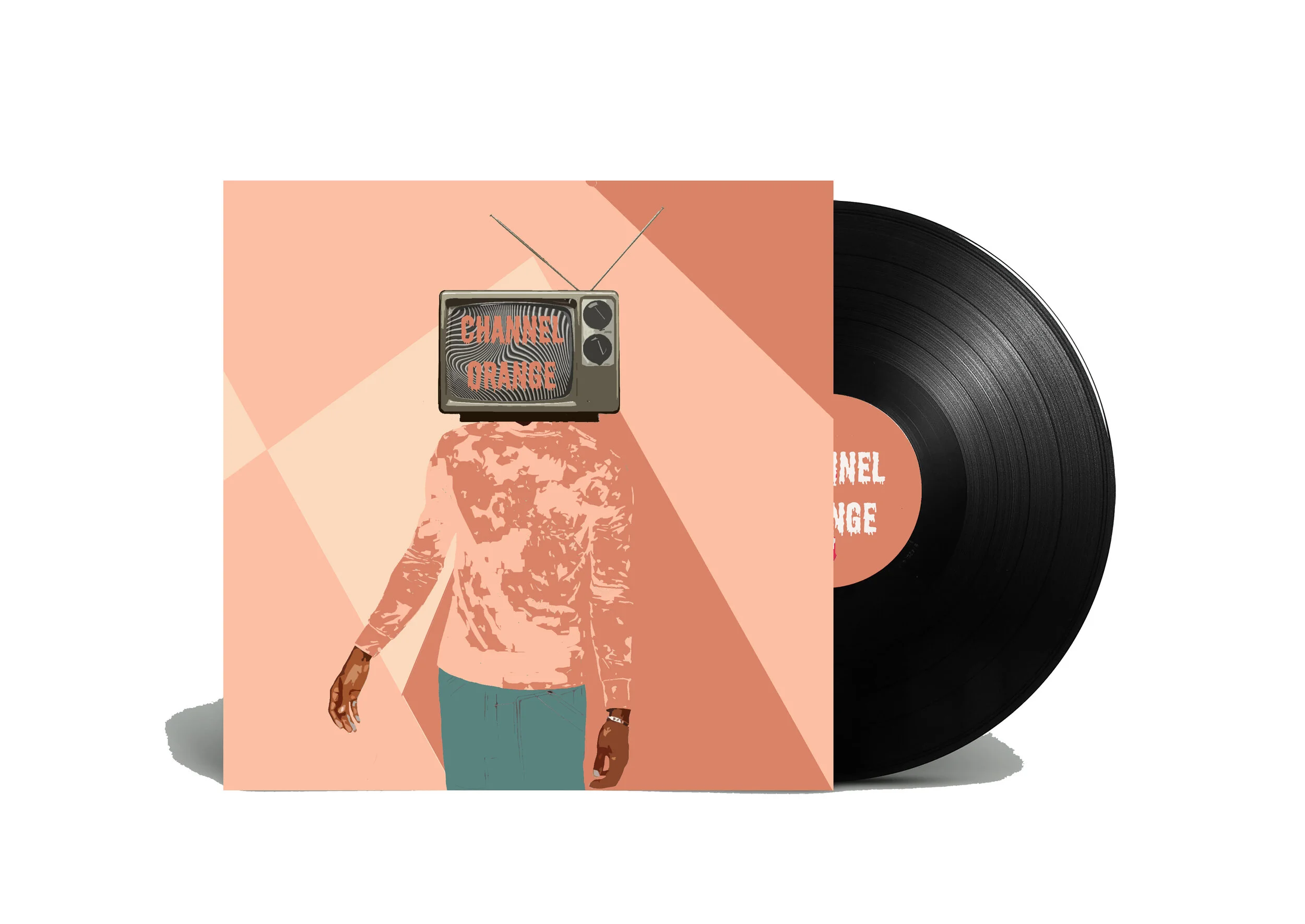
An up-close look at the final design. The album explores a complex emotional journey dealing with unrequited love, misplaced feelings, and longing.
The logo’s color palette is supposed to highlight Frank’s power in being an outsider in a culture where everyone strives to fit in. Channel Orange exploits the allure and pain of young people striving for luxe lifestyles.
The pastel colors highlight that his life isn’t always Glitz and Glam, something expressed in the album. It highlights the good and the bad, showcasing the journey of growing up.
The poster design encompasses the emotions, identity, and visuals of both the album Channel Orange, and Frank Ocean as an artist.